ShopDreamUp AI ArtDreamUp

Deviation Actions


Comments3
Join the community to add your comment. Already a deviant? Log In
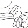
Your continued strength and weakness is in your color choice. It's very bright and potent and contrasts powerfully with black, and it also pairs nicely along with all colors chosen. But there's also a major fallback to using this sort of color choice - having no toned down colors means that there is nothing to make your strong colors stand out and pop.
Regardless, the form holds a good strength in the compositional space. It holds good balance and has nice repetition of elements in the hair, repeated in the fabrics. The only issue is that the composition doesn't activate the entire plane because it keeps pointing in on itself. It makes the negative space seem less intentional compared to some of your other digital drawings. Mainly the left side of the piece with the wall I feel this. If, for example if more of the wall or less of it was showing, I think it'd help.
Lastly, be careful about using a square(ish) picture plane. It often has a sense of balance and control, which fights with what your drawing's trying to show. If you really wan to bring on the energy, diagonals or portraits I find do the job pretty well.
The drawing's anatomy and framing seems pretty alright, but not your strongest. Keep an eye on how the eyes relate to the snout and where the shoulders rest. I can't quite tell if this is antrho or just pony. You've got plenty of style, so it works, but it just doesn't quite jive with me as much here, for some reason.